
This page may contain one or more affiliate links, which means that if you purchase a product through that link, I may receive compensation. The links will be identified with the text "affiliate link". Click to learn more.
You may have heard of the Famous Artists School, which has existed since the 50s. Started by some of the most famous artists in history such as Albert Dorne, Norman Rockwell and Ben Stahl, they have offered home study art courses in illustration, painting and cartooning. Why should you care? Because after several decades, the popular correspondence course still exists.
[UPDATE: No it doesn’t. They decided to close its doors in September 2015.]
The way that the Famous Artists School works is like this: the course teaches how to learn art at home using textbooks that are provided. Through artist demonstrations, you are shown what to do. You then mail your assigned homework to the school, which is then sent to a professional artist who will correct your work, write you a letter and give you a letter grade. A correspondence course, is the term.
I was attracted to the Famous Artists School when I found a copy of their textbooks and began to follow along just for kicks. Then when I realized that the school was still around, I knew it would be a lot of fun. I found out that you could request a free sample lesson.
The shipping was even free (which, I am sorry to say, is not so for sending in real assignments.) My assignment came back with some pointers, a personalized letter, and a coupon code to apply to the full course. It was so much fun, how could I resist?
I chose the Illustration and Design Master course. It consisted of 24 lessons. Estimating at one assignment per month, I could finish the course in two years (which I did).
Famous Artists School Materials
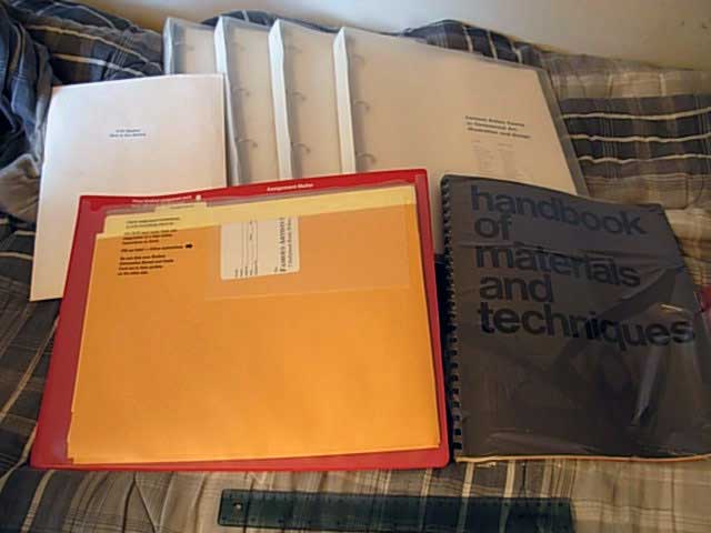
The materials were sent to me in only a couple days. The box weighed a ton. When I opened it, I discovered there was loads of stuff inside. The Famous Artists School sent me four gigantic clear binders with shrink-wrapped pages. The paper was of high quality, and most of the pages black and white.
Beside the four binders, there was a large thin book that said Handbook of Materials and Techniques on the cover. It turned out, it was a direct duplicate of pages printed in the binders. Why this was included, I have no idea. Perhaps as a convenient reference? Also included was a big plastic folder to protect assignments they are mailed in, along with a questionnaire, assignment sheets, and a labeled envelope.
There was also an odd-shaped book included, which was titled How to Make Money in Commercial Art, Illustration, and Cartooning. The copyright says it was published in 1968. Some of the paragraphs are hilariously dated. It warns that I should not use a payphone for a phone interview, because it will be embarrassing when the operator asks to insert another dime when my time is up. Pay phone? Becoming rare. Phone booth? Extinct, or close to it. Dime phone calls??
The Illustration and Design Sections and Assignments
First Section
After receiving the Famous Artists Course textbooks, I was able to begin my first lesson and assignment. The first section was a lesson to learn how to use the pencil, the dip pen, and ink with a brush. I was very excited to get started. The section was pretty brief, and had many picture examples.
The assignments for the Famous Artists Course were to shade a couple of trees to have texture, and to ink a picture of a clown. It was recommended to use illustration board. I found some dip pens and watercolor brushes in Walmart.
Second Section
While waiting for the critique results from the first section, I had begun, and finished, the second section’s assignments. The topics this time were painting in watercolor and opaque. In both cases, the colors were black and white only.
For the assignment, I bought Crescent brand illustration board, cold pressed. For the watercolors, I was told to use lamp black. So I bought Winsor & Newton Cotman WaterColours Lamp Black, number 337, series 1. It seemed to work out okay for me with no problems. For the opaque, I bought Winsor & Newton Designer’s Gouache, Jet Black and Zinc White.
The Famous Artists Course textbook for Section 2 says that I should use premixed grays, however I could mix my own if necessary. Well I had a hard time finding premixed grays anywhere, so I just mixed my own on the fly. While painting, I would sometimes run out of the paint I mixed, which is bad. Matching the exact color again is impossible. I eventually found out that there is a brand that sells prepared grays. The company is Golden Artist Colors or Golden Paints. They call their line Heavy Body Acrylic Neutral Grays.
Third Section
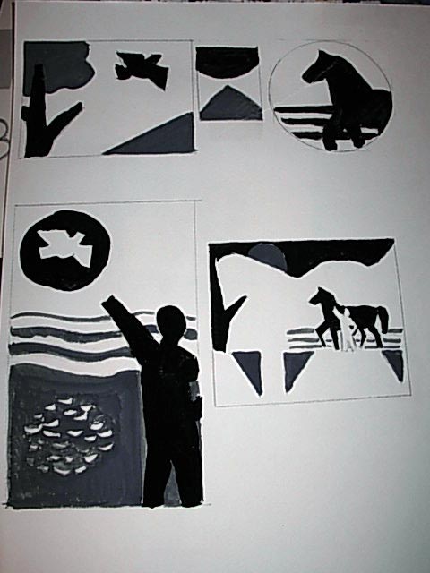
This is a section that seems exciting because of its topic. Design to me has seemed somewhat mysterious, particularly because one problem can be solved in many different ways. That is what section three of the Famous Artists Course is all about: design.
There is not much to say about this section. It goes through many aspects of design, such as shape, size, and negative space. I think the most interesting thing, ironically, is the assignment. Much of it are multiple choice questions, some quite difficult. The main part is to come up with a design of your own and glue pieces of colored paper to the assignment sheet. I came up with what looks like quilt pattern or something.
Fourth Section
By this point, it was taking over a month to get my assignments returned to me. It was taking longer and longer, it felt like.
This fourth chapter has to do with composition. What this means is arranging elements in a picture in a pleasing manner. The section discusses line, tone, depth, arrangement of elements, and other topics as well.
What is fun about this chapter is that part of the assignment lets you be a little creative, which is always something good to look forward to with this course. Unfortunately in one of the assignments, I tore the paper. I really did not want to redo it, so I mailed it anyway. When it came back, the instructor told me that I had to be more careful. The assignments were to take solid shapes and arrange them in a pleasing manner… which of course, is the topic of this chapter. I had a hard time with this assignment. The instructor from the Famous Artists School was not giving me a lot of feedback, so it was frustrating.
Fifth Section
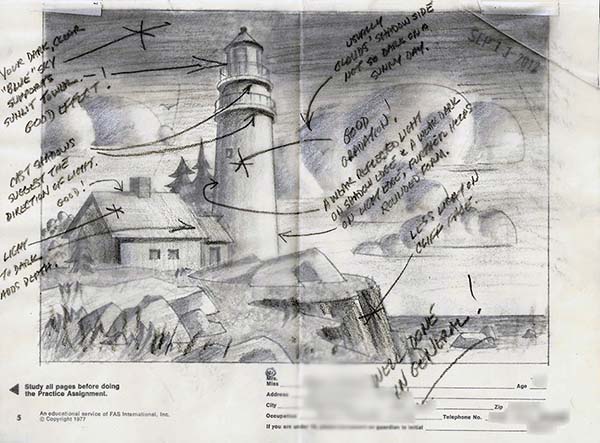
The fifth section focuses on perspective and tone. I thought I understood these two topics pretty well, and that the assignment would be a slam dunk. Of course, I was wrong.
One of the assignments for this section was to cut out two provided silhouettes of houses, work out the two-point perspective and paste them on some paper or something. Sounds straightforward. However when I tried it, the two houses were separated by several feet… obviously not what was intended, as it would not have fit on any size of paper. Even more confusing, the assignment says:
Pay particular attention to the placement of the buildings in relation to each other and the background, so that they make a pleasing and interesting design. (Both buildings have the same eye level.)
To me, this made no sense. As soon as an object would be moved in nature, the perspective lines would change. So how could I arrange them to be an “interesting and pleasing design” if I had to work with exact placement and the rules of perspective?
The best I could do is guess. I guessed wrong. I sent out the Famous Artists School assignment to make it pleasing, arranged on a reasonable size piece of paper, and tried to get the perspective as close as I could. The assignment came back saying that the perspective was off, without showing the correct answer. This was frustrating, and the instructor I was assigned had a habit of doing this. When I mailed in my next assignment, I included a letter asking for an explanation. He then responded with a drawing of the correct placement of the houses, and said that there were other solutions as well. However he did not explain how I could have the freedom to arrange the houses in a pleasing design. Oh well.
Sixth Section
The next section was about form. What it meant was seeing things as three dimensional and not just a flat-looking paper cutout on the page. A big part of this, as the chapter explains, is the silhouette of objects overlapping.
The assignment was fun because it involved assembling a cardboard barn and drawing it. The instructions said to draw it as if I were standing next it, in order to show its size and solidity. After arranging the paper barn in front of a window to give it strong lighting, I photographed it. (I zoomed in to avoid the lens-warped effect.) I very carefully imitated the picture to the point where my drawing was completely identical to the photo. “There was no way I could get a bad grade”, I thought. If this is exactly how it would look in nature, how could I be wrong?
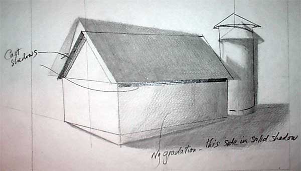
Well I was wrong anyway, apparently. My drawing was corrected, telling me my shadows were wrong. At this point I began to realize that nothing I could do would be seen as the right thing.
Seventh Section
This chapter was on texture and pattern. There are some interesting head comparisons from Norman Rockwell‘s drawings in this chapter. The assignment was to make a painting based on several photographs that emphasized texture. Some of them were of a barn, one showed a rock wall, one showed a pond, etc. So I painted a barn with a rock wall and a pond. My instructor, rather than correct my work, simply wrote a long note saying that it deviated too much from the photographs. I was aghast.
Eighth Section
This section was on color, which meant this chapter was actually in color. The other chapters are in black and white, so it was a fresh change that was gladly welcomed. The assignment was to paint a series of flags in different colors to show that I understood warm and cool color combinations. I also had to paint a sunny nature scene and another painting that was dark and mysterious. To my surprise, the instructor actually liked what I painted. I was in shock, for he had not genuinely expressed me doing a good job before.
Ninth Section
This section pissed me off. The topic was drawing the human figure, which I was waiting for. Well it turns out that this section is very different than the same chapter from the original Famous Artists School books from the 1950s. Do not get me wrong, some of these sections have been updated more than others, so it has been a mix from the start. This one however, takes the cake. Originally, the Famous Artists School lessons taught by the original staff emphasized drawing from tubes and cylinders to create your mannikin. It was very step-by-step simplistic. This rewrite of the same section, I discovered, was mostly about scribbling and gesture drawing.
The assignment was to make several non-specific drawings. One of them was instructed as:
In any drawing medium you wish, make a number of figure drawings. Start your drawings by establishing the basic gesture. Then, in some of your drawings, develop the cylinder forms of the figure. In other drawings, stress the bulk of the figure through modeling the mass and weight. Of all these drawings, select the ONE drawing you feel most successfully establishes the form in space, and send it in for this assignment.
Okay, so clearly I was instructed to send in ONE drawing for this assignment, as was emphasized. (ONE was underlined.) Well the instructor responded by telling me that I read the instructions wrong, as it was asking for more than one drawing. Perhaps I misinterpreted?
Tenth Section
The topic with this section is head and hands—and this time the chapter is relatively untouched from the original lessons. I had been practicing drawing heads for the past two years. I had this nailed! Or so I thought. The assignment was to draw hands and two heads. One head would be from a magazine cut-out. The other would be a self portrait.
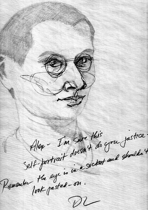
Again, my work was harshly criticized without too much explanation. I included a letter with my next assignment asking how I should prevent the eye from looking pasted on. He sent back an oval of a skull socket with the circle of an eye inside. Perhaps I missed the point.
Design and Art Elective
This marks the end of the basic course and the beginning of the “master” part of the course, where you get to choose to begin with figure illustration or design and art direction. I chose design because I thought it would be better with career in mind. Things get confusing at this point because the chapters stop correlating with the assignments. This makes it questionable which sections to read in advance. Some of the Famous Artists School assignments even felt completely random, as if not based on any of the sections at all.
It will be simpler just to list these assignments more quickly like this:
- Assignment 11: Experimental Design — The exercises are to arrange colors and shapes to see what clash and feel uncomfortable or cluttered. Also, simple designs are created to represent countries.
- Assignment 12: Lettering — The exercise is to create letters that are in the shape of whatever word it is. For example, the word camel is shaped like a camel, where the M has long legs… like a camel. Why this is so important, I have no idea. The assignment is to come up with some book covers using your lettering skills.
- Assignment 13: Advertising and Editorial Design — Basically this is all about making a corporate logo. The assignment is to make a letterhead and envelope. A lot of section 19 focuses on the logo and branding; only a few paragraphs on the bottom of a page discuss letterheads. So you are left in the dark with how to do the assignment properly. Pre-printed addresses are provided to cut-and-paste in place, so you do not need to be bothered with any text.
When my assignment was returned, virtually nothing was said about my logo. Rather I was scolded for not including the corporate name or email address. As obvious as it might seem in hindsight, some instructional guidance beforehand, instead of being told to paste on pre-printed text and being penalized for it, would have been more helpful. Perhaps I should not follow directions too closely.
- Assignment 14: Specialized Design — Basically it is about making posters and such. For the assignment, I painted a poster for a zoo. This is where things went awry. Not only did I not get my assignment sent back, but was not given a letter grade as well. I found out later that it was mailed to the wrong person. Eventually it found its way back to me. The worst part of the whole fiasco was that someone else had witnessed my embarrassingly bad eye for design.
- Assignment 15: Mood and Energy — Instructed to make a painting interpreting the music of a popular song. No chapters are referred to for study, so you just have to be creative.
- Assignment 16: Promotional Material — Use the design you made for the previous assignment and use it to make a CD cover, newspaper advertisement and poster.
- Assignment 17: Television Art — Make a storyboard, aka pictures describing a television commercial
Figure Illustration Elective
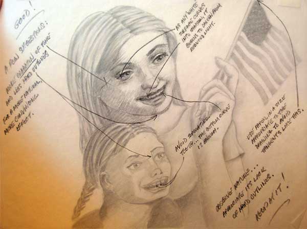
I was excited to start this elective, but it did not leave room for much creative freedom as I had hoped. Even so, I found it to be the most fun. Around this point, the Famous Artists School assigned me a different instructor. One was clearly better than the other. I will not mention any names, but if you look at the feedback in the drawings above compared to the ones below, you will see what I mean.
- Assignment 18: Advanced Observation — You must trace perspective lines on a painting, make gesture drawings, and make a painting of one or two people in an everyday situation. This assignment is one of the few that leaves a lot of freedom of what to paint so be sure to take advantage of it.
- Assignment 19: Advanced Figure Drawing and Composition — Make some small drawings of ballerinas, and detailed drawings of naked people. Also make an editorial, advertisement or book illustration.
- Assignment 20: Advanced Line Drawing and Tonal Painting — Make another editorial, advertisement or book illustration.
- Assignment 21: The Interior and The Figure — Make six drawings of a person sitting in a living room from different angles. Also another editorial, advertisement or book illustration. Noticing a pattern here?
- Assignment 22: The Landscape and The Figure — Make several similar paintings showing the different time of day. Also another editorial, advertisement or book illustration.
- Assignment 23: Mood in Illustration — Make several similar paintings using color and shapes to represent different moods. Also another editorial, advertisement or book illustration.
- Assignment 24: The Illustrator as a Reporter — This is the final project. Make two drawings and one painting based on a local event. This is your other opportunity to be creative, as you can report on pretty much anything that you would like. It is your last chance to shine to the Famous Artists School instructors.
Is The Famous Artists School Worth it?
Art is something that you, for the most part, teach yourself. These courses are not any different. The difference is that instead of having to go through many books and have to figure out the process yourself, the textbooks guide you one section at a time, followed by someone examining your work. Just knowing that someone respectable will give their honest opinion is of great value.
This course is hard. That being said, you cannot really fail it, as long as you do all of the assignments. The lowest grade seems to be a C. (Which I received perpetually….) I made the mistake of thinking that if I submit my work less than perfect, the instructor will tell me how to overcome these obstacles, which was not often the case. So you must always try your absolute best.
When the course is completed, you will be given a nifty certificate to brag about, and a signed letter from the school’s president.
Famous Artists School is a way better deal than Art Instruction School. Another popular correspondence art course, Art Instruction School, is kind of a ripoff. First of all, the price is outrageous. Last I heard, their materials include 8 x 11″ pamphlets as textbooks, a pencil, and a plastic T-square. compare it to Famous Artists School, which cost less than half of what AIS charges, plus gives you gigantic binders, books and reference materials. FAS also teaches in multiple mediums, whereas AIS only teaches in pencil. (Also, FAS does not send a salesman to your door that will lie to you and say you will get a good art job quickly if you take the course.)
[EDIT: Art Instruction School closed its doors in 2018]
So all of that sums up my experiences. Any comments? Have you taken correspondence courses yourself? Leave a comment below. (Also check out my Kubert School article as well)