Rob Liefeld and Jim Lee Compared

Some may disagree with me, however I think Rob Liefeld may be a good artist, and I intend to prove it. People like to use Rob Liefeld as a punching bag, but let me tell you: there are far worse artists, believe me. So how am I going to prove that Liefeld is any good? By comparing his art work to one piece of art we can agree were made by a talented artist.

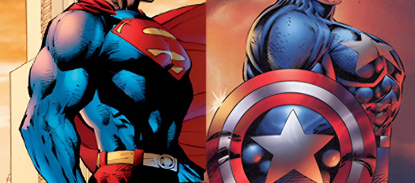
Now take a look at the top image. On the left is Jim Lee, who is generally undisputed as a good artist. On the right is a common example people use to demonstrate that Rob Liefeld is a bad artist. Do you see what I see? Yes, they are nearly identical. So how can one be good and the other be bad? Well let us look a little closer.

rob liefeld

It’s the shield. Behind that shield, people assume, is a straight back, and the only explanation is that the chest is too puffy or something, due to Rob Liefeld not knowing anything about anatomy. But as you can see from the drawing, he knows plenty. Granted there is plenty of exaggeration in the chest area, the head measurements are spot on.
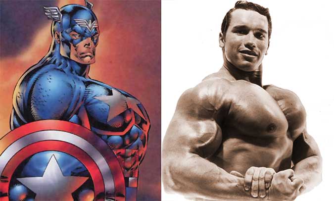
Rob Liefeld and Arnold Schwarzenegger

If I knew who figured this out first I would give credit, but someone in the vast arena known as the internet pointed out the similarities between Rob Liefeld’s Captain America drawing and a photo of Arnold Schwarzenegger. Could this have been used as a photo source or inspiration? It is true that Arnold is flexing in the photo, but at the very least it could explain where the exaggeration originated from.
Long legs in comics


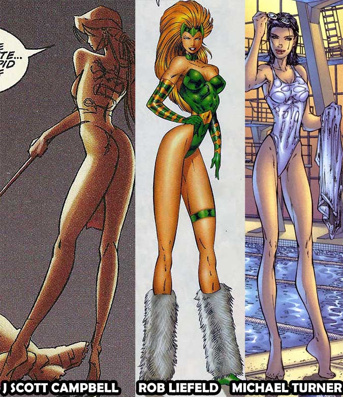
Often Liefeld is picked on for his depiction of women. What blows my mind is that no one seems to realize that tiny waists and long legs were the way things were done during the mid-nineties. Just take a look at some of the early Image Comics artists in titles like Fathom or Gen 13. The only difference I see is that Liefeld did not seem to use the invisible-high-heels trend.

42 thoughts on “Rob Liefeld is a Good Artist?”
  1. I think Rob Liefeld is successful in other ways: for example, composition. Take a look at the cover for X-FORCE issue 3.

    http://www.mycomicshop.com/search?q=X+force+3

    The result is incredible action and excitement. Yet people focus on dumb things like tiny feet and thin waists decades after this comic was released. Does it really matter that much, people?

  2. Can you just try this defense with any of his drawings of any woman ever criticized? Because i would love to see that defense.

      1. Ah yes, because every female is that woman, and because being in that pose (highly uncomfortable, by the way) is logical for someone who expects to be in combat frequently. Ignoring the wasp waists, because it’s a stylistic choice, and that happens a lot in comics, he draws them in unreasonable (and often near-impossible) poses that are clearly meant to showcase both T&A.

        But none of what’s up there justifies his overall lack of grasping anatomy. The implied spinal curve is something to point out, because I totally believe that he had one behind that shield, but his arm is way too short. His hand should rest by the knee, even with those rippling biceps, unless he’s holding the shield forward for some reason, in which case the shield should be larger. But he’s not, so his arm is short enough to be cut off at the elbow. Using this picture as the sole piece of evidence to decide his skill as an artist, it could be decided that his art is in need of some serious work.

        However, in recent years he’s really cleaned up his style and worked a lot on his anatomy, he’s also good at drawing muscle lines (I guess) and that’s commendable, but he still gives them half-arms and deformed spines and makes all of his women from the same over-sexualized, smoky-eyed-wasp-waist-no-spine-torpedo-tits-spider-legged formula he always uses. That shows inability to add variety to female characters since they all look the same, which isn’t becoming of a major comic book artist. His art is nothing special, and in many ways still pretty atrocious, regardless of who colors it and makes it look more gorgeous than it really is.

  3. Jim Lee is awesome, Rob has always had anatomy issues. He adds in extra muscles and has no sense of anatomical perspective in that piece with Cap. Even if his character is 8 heads tall, you still demonstrated that his torso is WAY too thick.

  4. “yes they are nearly identical” No they’re not. i also like how you made the green outline which didn’t actually outline his chest. you must be trolling.

  5. Sometimes “too much” anatomy can be awesome. There’s many great American artists who both follow correct anatomy with muscles and those who don’t, but it doesn’t turn out bad.
    I can’t say Liedfeld is great at anatomy though. It’s nice you’re trying to defend him, because he does a whole helluva lot better than I could draw. But still, it’s not anything to write home about.
    I think an amazing artist who exaggerates anatomy a ton is the Korean artist Boichi. Can’t say I’m a fan of anything he’s done besides Sun-Ken Rock (a comic he published in Japan, rather than his home country of Korea), but he has some amazing art (although his earlier art is pretty rough).

    http://i.imgur.com/NcDhDop.jpg This is exaggerated anatomy done right. My art teacher can’t stand Boichi’s style, but it’s amazing regardless.

  6. If you are trying to argue that the Captain America art is good, it’s not. If your point was to show that Liefield’s work is not nearly as bad as it is often exaggerated to be, then bravo. It’s a lousy Captain America, but come on people, get over it. The thing about Liefield is, both his fans and his detractors give him too much credit. He didn’t destroy a decade’s worth of comics. He’s not the worst artist who has ever lived. He wasn’t even the worst artist who founded Image. Style is more important than being anatomically correct, and his style is often mistaken for incompetence. The guy has trouble drawing feet, but why do I give a crap about feet? “Oh look, Liefeld hid the feet again.” So what?

    Liefield’s X-Force came out at a time when we were all watching Aeon Flux and reading The Maxx, which also delivered wildly exaggerated depictions of the human body. I always enjoyed how abstract things got in the early 90s. When I first saw characters like Cable, the weapons, muscles, pouches, and anatomy didn’t even make sense to me, but it was bizarre and intriguing. It was different. He wasn’t running around in tights. Personally, I don’t see why Liefeld gets crucified while John Romita Jr gets a pass. Have you ever read the first Cable miniseries, which Romita drew? Romita went absolutely nuts. Don’t believe me? Just check out these shoulder pads…

    http://24.media.tumblr.com/tumblr_lq4e9pPtuX1qad8x6o1_400.jpg

    However, Liefield certainly hasn’t done much to help his reputation. He’s become a scapegoat for a whole era of comic art, while countless artists who are just as guilty get a free pass. I think this is largely due to two things. First, he’s an asshole. He throws public Twitter tantrums, he quits every good job he lands, always complaining about his bosses. He lashes out at his peers. He was careless with finances at Image. He has such an ego that he’s become a lightening rod for anyone who hates early 90s comics.

    Second, his art sucks. Now I know that I just defended his work in X-Force, and I will defend his work in New Mutants and X-Force until my dying breath. But then something happened. For the talented artists who left Marvel to form Image, they suddenly had complete creative (and for Liefeld, financial) control. That isn’t always a good thing. Artists often do their best work when they have to collaborate, compromise, and improvise. People work well under pressure. When Liefeld drew X-Force, he had an inker and a colorist that complemented his artistic style and brought out the best in it. His artwork took a steep dive after Youngblood started, and hasn’t recovered. His work on the New 52 was just bad. Jim Lee, Greg Capullo, Marc Silvestri, etc, have improved their craft over the years. Somehow Liefeld has gotten worse, and everything people don’t like about his art has seemingly been amplified. I look at covers for Deathstroke and Grifter and it just looks awful to me. I was very excited in 2004 when I heard he was bringing X-Force back with the same writer. I wasn’t even collecting comics at the time, but I went to the store and bought the first issue. I didn’t go back for the second.

    Still, I don’t hate the guy and he draws far better than I ever could. He drew several of the first comic books that I ever bought and read. Life is too short to hate a comic book artist, and I’d still love to see the guy succeed. All this talk about feet and anatomy… whatever.

    1. Uuuuum, no, we were not reading The Maxx when X-Force came out. Maxx was launched at the inception of Image, which Liefeld help found. There was two years between X-Force #1 and The Maxx #1. It’s funny that you mention The Maxx, because if you want to see what a good version of someone who exaggerates anatomy, look no further than Sam Keith. Yeah, Liefeld is given too much credit from both camps. I don’t give Romita Jr. a pass either. I am SO tired of his friggin’ block head style. I actually lump him in with Liefeld and Javier Pulido, all people who shouldn’t even be allowed to draw Archie comics. You say Liefeld, in his New Mutants/X-Force days had an inker and colorist who brought out the best in his work. Did you ever stop to consider that maybe it’s the other way around? Maybe they were able to cover up just how bad his work actually way, or at least blunt the impact.

    2. No you didn’t..Romita JR?! The whole body is in proportion! You just opened with, “Style is more important than being anatomically correct”, and Romita is a case of having both style AND being anatomically correct. You can like something all you want, but leave the art critiques to the actual artists. I’ve met Liefeld in person, and he’s a self inflated jerk. (we were getting a deal with image) Larsen even thought he was a bad artist.

  7. You didn’t even outline the original correctly and act like “see see he’s great”. Way to brush off the issue with the chest. That alone is obvious to anyone with an understanding of anatomy that this drawing is a giant turd. To compare it to Jim’s superman is so ignorant. If refuse to see that then have a glance at the “40 worst Liefeld drawings” list. You can’t defend this guy.

  8. I would like to point out the arm that looks to be over a foot thick.

    Even if the chest was fine in this picture- which it is not, by the way, as you shrank it quite a bit in the green outline- this would still be an example of ridiculous and stupidly large muscles, to the point where they would get in the way in a fight.

    I’m sorry, but no, Rob Liefeld really is a terrible, terrible artist. One of the worst artists I’ve seen continually get work with the big comic companies. And while Liefeld certainly wasn’t the SOLE reason for the 90’s having so many bad comics… I’m willing to defend that he was one of the biggest contributors. Especially considering that his style somehow became POPULAR, which lead to people actually emulating his terrible, over-exaggerated style.

  9. Hmm. I’m all for interesting defenses of the publicly reviled, but I don’t think the argument here adds up. First off, as Eric has pointed out, Captain America’s arm is way too short. Second, even if we accept for sake of discussion that he’s supposed to be in roughly 1/4 profile like the Jim Lee Superman (which I don’t), what of the shoulder? Superman’s shoulder is swept back in a manner consonant with a person standing at a diagonal to the viewer’s perspective, whereas Cap’s shoulder is in full profile. It also looks to me like his neck is similarly in profile, but it’s harder to tell. While this is certainly better than the horrific meat trapezoid of Cap’s chest if he isn’t standing in 1/4 profile, those are still some pretty elementary anatomical screw-ups. And that’s not even getting into his Momaw Nadon women and various other pieces that this article doesn’t address.

  10. You’re not wrong that the chests themselves look nearly identical. In fact it looks suspiciously close enough that it could almost have been traced. In fact, having had a poke around at this guy on Google, having never heard of him before today (I grew up on British comics), it seems he does a lot of “reuse” of base artwork (this may be a fairly common thing?). Usually his own but who knows in a pinch? Perhaps he has a portfolio of body parts, pulls them out and sticks them down on paper with little regard to proportions and anatomy. Might explain some of what I’ve been seeing.

    Back to the chest though… Considered in and of itself, it’s an OK, if muscly chest, probably not even much out of proportion to the head. But it’s in the wrong place and the wrong angle. Supes is clearly at something like a 4:15 position whereas from CA’s head relative to his back, he’s more like 3:00-3:15 (look at the belt buckles too). If he were a robot and his chest was actually hinged on his right, it would be open and displaying all his wiry goodness and flashing lights. But that’s supposed to be flesh and blood. It’s just wrong. It’s not so much that he drew it even, stuff doesn’t always come out how you think, its’s that he took a step back at then end and thought it was acceptable to submit.

  11. I kind of figured this article was a joke: arguing that Liefield may be a good artist in a way that shows he’s not.

    Certainly, there’s something to the argument that Liefield draws his characters with dramatically arched backs. However, that doesn’t prove that he may be a good artist.
    The Glory and Avengalyne cover, quite possible one of the great anatomy atrocities of our times, shows that.
    http://amzn.com/B000USPJJY/?tag=whitebeans-20

  12. Love it!
    Liefeld is a great stylist, one of the best superhero cartoonists and I prefer this drawing over thousands of stiff, boring, “correct” depictions made by “fandom”-approved star artists.

  13. “Love it!
    Liefeld is a great stylist, one of the best superhero cartoonists and I prefer this drawing over thousands of stiff, boring, “correct” depictions made by “fandom”-approved star artists.”

    HAHAHAHAHAHAHAHAHAHAHAHAHAHAHAHAHHAHAHA

  14. I love Liefeld’s work.

    I don’t understand those who hate it.

    It can only be jealousy.

    I made a comment recently about the TV show, Fear the Walking Dead. In it, I stated that I was surprised that those responsible for the show were honest in their depiction of liberals wanting to loot and riot, even as the Zombie Apocalypse was descending on them. The response: IT’S ONLY A SHOW!

    Well, it’s only a comic book; and, comic books, especially superhero comic books, aren’t based on reality. I do like those comic books that have realistic art. But, I absolutely love the women Liefeld draws – arched back, curvy bottoms, and pendulous,yet firm breasts. What’s not to love?

    1. It’s funny; I was telling friend recently that Liefield’s work only appealed to right-wing, American men: No first hand knowledge of real women’s bodies & the latent homoeroticism of the male physique.

  15. The head/shoulder/arm appear to be a side view at eye-level or slightly below. The chest appears to be a 3/4 from slightly above.

  16. Jim Lee’s superman looks nothing like rob’s cap drawing. The way superman holds his arms shows his puffing out his chest and tensing, also his chest is roughly have the length of caps chest. The way CAP holds his arms (straight down) just makes him look like he’s tensing his entire body. And even if caps back was curved in, that’s still anatomically incorrect. U also argued that rob got head proportions right, which an infant with a shit on a stick could do, caps jaw os far too defined

  17. Rob sucks…. he has no perspective or concept of human anatomy. Hes a one trick pony that needs to fade away from comics…. his only success is Deadpool. and hes a cheap copy of original ideas. His work is hollow and pale copies of decent art. Youngblood was just the avengers with a paint job.
    Comparing Lee’s Superman to Cap? look at the head and neck placement, where is his left shoulder and arm? his chest is swung toward you but his spine and limbs are in line with his right arm. Hes crap and will always be.
    Rob the slob

  18. He is so bad that he needs someone to point that he is good but the good stuff is hidden behind a shield.

  19. I always defended Liefeld. An artist don’t need to be good at everything…he has his appeal, he accomplished plenty, the Image crew was kids who beat records of sales on Marvel and DC and changed the game by creating Image and retained rights of their characters…so he’s not so good at anatomy? so what? Other guys would be great at anatomy but can’t create nothing and accomplish nothing. All that said. The Captain art is horrible and it has nothing to do with this Superman…bad comparation…

  20. Is…this a joke???

    1. comparing the Superman and the Captain America picture. This only serves to show us what that pose SHOULD look like if it’s done well. They are NOT “nearly identical”

    2. While the Schwarzenegger picture is impressive and shows that chests can get pretty big, try overlaying it over cap, you will see that there are still many differences that cause Cap to look …weird. The angle of his chest, the belly that’s sticking out way to far. Arnolds upper bopdy is turned towards us more and if you look at his head, you’ll see it’s almost in the middle, while caps is on the left, with all the chest bulging out to the side. And flexing, you even admit that.

    3. Your green outline leaves out the worst part of the picture. What does that proove? That you couldmn’t make it look right without cheating a little.

    4. Just because “That’s what people drew like back in the 90s”, it doesn’t make it better.

    I don’t hate Rob. He has done stuff that is much better. Some of it is pretty good if you enjoy that style.
    But the Cap?? No. The fact that even people who have no idea about art, anatomy, proportions etc, think the Captain America picture looks ridiculous is a clear indicator for how bad it really is. You can like Liefeld if you want, you can like his style, his storytelling, the characters he created or his accomplishments in changing the comic industry. You can even LIKE the picture. But it IS bad anatomy. That’s just a fact.

  21. Kirby was attacked for the same kind of thing. Comics artists fall into broad 2 categories photorealistic and stylistic. If you talk stylistic Liefeld is one if the best his work is identifiable and resonates with a lot of people. Only a few have a unique style that meets the requirements of being exciting to look at as well as not being a copy. Almost all the photorealists look similar. Many fans prefer the artists who were not cookie cutter.

  22. There really are two camps: those with a sense of proportion and an eye for detail – and oblivious fanboys lacking taste, bereft of discernment and zero taste.
    It’s like showing someone a Frazetta and a Vallejo, and waiting for the moron to talk about the merits of Vallejo and trying to defend airbrush van graphics.
    Kirby has style, but he can draw, Ditko is pretty terrible, but he can be consistent with scale and proportion – even make characters distinguishable from one another, etc.
    Liefeld ONLY has “style” – if you could call it that – he has no substance and is a product of the nineties embrace of “extreme” imagery, the result of a dumbed down population who can’t tell the difference between garbage and actual skill. If you defend Liefeld, in any way, you are simply oblivious to what constitutes ability, merit and execution, PERIOD.

  23. You are absolutely wrong.

    Let’s take things from the start. On the first image you show a drawing of Superman from another artist and Captain America from the artist in question. They are most definitely NOT “nearly identical”. There’s a few “details” that are very important.

    For starters, you can see both his left pectoral and his left triceps, unless that little piece behind his right shoulder is his right shoulder blade, which would be just as bad, anatomically.

    On Superman, You can see a somewhat exaggerated chest, but the perspective is correct. You cannot see his left triceps or right shoulder blade.

    Then, Captain’s chest is WAY too exaggerated, even if he had the proper perspective. The thing is, Superman in this picture is anatomically and perspectively perfect, whereas Captain seems like you’re looking at him from the side, but at the same time can see BOTH his back AND his chest as if he was turned towards us.

    Now let’s move to the Arnold pose. There are many things about this that make the comparison not only misleading, but Arnold’s picture further proves that the drawing is wrong.

    Initially, we cannot see Arnold’s back. If you look at his right shoulder (and consequently arm), it is the only thing of him that you see at the left. There’s nothing else beyond it (shoulder blade/triceps of his left arm – like with Captain America).

    Then there’s the obvious part where Arnold, in order to achieve this exaggerated chest, has to show his left arm. That’s right. In Arnold’s picture, his left arm (from the biceps and beyond) is visible in the image, holding his right arm from the wrist.

    Nowhere in Captain America’s drawing do we see his left arm. In order to bring your pectorals in that position and show them that much, you have to move your left arm at the front like Arnold does, whereas the EXACT opposite happens with Captain since it is implied that that little piece I was talking about earlier, is implied to be the triceps of his left arm.

    Lastly, even if that little piece wasn’t there and we could also see his left arm, like in Arnold’s image, it would still be awkwardly exaggerated. Draw a straight vertical line from where Captain’s chest ends, and then where his face ends. That space is HUGE. Do the same with Arnold and you’ll see the difference.

    Another thing on why it is anatomically wrong and cannot be excused as “comic book exaggeration”, is if you look where Arnold’s left pectoral starts (collar bone). Look how close it is to his neck. How far up it is.

    Then look at Captain’s left pectoral. It starts way lower. With Arnold, his left collar bone (top of his left peck) creates an almost 90 degree corner with his neck and they’re so close, they almost touch. With Captain, his left collar bone (top of his left pectoral) is so far down that you could fit a whole other neck with a head on top of it in that space.

    Superman’s picture doesn’t have that much space between his left pectoral and his neck, and you can even see his left arm (which, just like with Arnold’s image, shows that in order to bring your pectoral that far ahead, you need your left arm to be showing too).

    Now as for the women an how they’re drawn, all three drawings are terrible. I don’t care that that’s how they used to draw women back then, but they are anatomically atrocious and ridiculous. They look like these aliens from Men In Black 2. You know which ones I’m talking about.

  24. As someone who has made his living from art for over 30 years, I will say, Rob can turn out some pretty good art, but there is no legitimate defense for that Captain America drawing. Anyone that believes it’s anatomically correct, clearly has no idea how the skeletal structure connects and musculature rests upon it. I’m guessing he was working from a tight deadline and had no time to correct/redo.

  25. Comparing the Captain America drawing to the picture of Arnold doing the side chest pose as a means to justify the quality of Rob’s art is ridiculous. It proves you have no idea whatsoever how anatomy works. If you look at the picture of Arnold, the pecs are popping off of his body. They are clearly a separate entity from his rib cage and have their own distinct shape, mass, and volume. Meanwhile, on the drawing of Captain America, the pecs don’t pop at all; they’re completely flat. In reality, for his chest to jump out that far, Cap’s pecs would have to look like enormous balloons. Rob just drew this big, shapeless mass with the chest, ribs, and abdomen all flowing into each other and then just drew the rough outline of pecs on top of them. That’s not how it works. The Jim Lee Superman drawing isn’t perfect, but if you can’t appreciate the subtle differences that make Superman look like an actual human being and Rob’s Captain America look like…I don’t know whatever the fuck, then you have no business writing articles like this.

    Also, spines don’t work the way you seem to think they do. Google “bodybuilder from the side” to see how back curves actually work.

    As for the three-way comparison of women, comparing three crap artists to each other isn’t really a good argument. There’s no excuse for how ANY of those women are drawn, but even in that instance Rob’s is the worst. Legs are not supposed to be over twice as long as your head and torso put together. And I love how you choose to use the one picture of a woman where Rob didn’t draw her standing on her tippy-toes like the other two.

    That said, if you’re a fan of Rob’s art, that’s perfectly fine. You just have to understand that his art is subjectively good to YOU (how that can be, I can’t understand). But in reality, it is not OBJECTIVELY good by ANY standard.

    That said, I kind of suspect this article may be a very subtle parody. If so, then I apologize. If not, then…um, yeah. Okay.

  26. I like Rob Liefeld art, but some of his stuff is just wrong lol. He does exaggerate his art and he even admits to not knowing proper anatomy, but there r times to exaggerate and times it just doesn’t work. That Cap America is terrible and maybe looks like it may have been a mistake between pencils inking and color, but still it’s just wrong. In art they tell u to learn proper drawing so then u know when u can break the rules. I think Liefeld and some of his mistakes r due to rushed work, bcuz he can draw…not pin point proper anatomy, but stylized. Jack Kirby one of the greats did not draw proper anatomy, but he rarely made glaring mistakes. Anyway overall Liefeld is a good artist, but those mistakes r there and in this cynical world that’s the stuff folk focus on.

  27. This is a joke, right? Rob Liefeld sucks. In the example of Captaian America side chest, It’s not that his chest is too big, it’s that he messed up the placement of the head. This is supposed to be similar to the Arnold pose? Look at the perspective of Arnold. Visualize in your mind wherehis left shoulder joint is and where his right shoulder joint is in space.. Draw an imaginary line between those 2 points. Take into account the angle of the pose and where his imaginary spine would intersect that line. Do you see that it lines up exactly with his neck and the base of his skull? Now do that with the Captain America image. His neck and the base of his skull where it meets the spine is about one head off or 10 inches behind where it’s supposed to be, creating an illusion of thickness in the chest. This is why Liefeld SUCKS. He drew the head too far back on the body. Cut off the head with photoshop and move it more forward on the chest. Anatomy corrected. Problem solved

  28. His fans bend themselves into pretzels trying to justify all of Liefeld’s drawing mistakes. Either “who cares about feet” or the famous “style is more important than competences.”

    Look, if you want people to forgive all of the bad anatomy, no storytelling, no backgrounds, or the fact that his characters change costumes from page to page, then quit saying they are fine. Say you like his style. Say you know many don’t and that’s okay. If you listen to Rob talk, that is what he says. He continues to try to get better but he understands his weaknesses. His work sells a lot of books. If his work didn’t, his work would’ve ended with that HAWK & DOVE mini series back in 1990. But he is still here 32 years later.

  29. Oh absolutely not. I’ve been lifting weights with Arnold’s Mr Olympia poses… And a captain America poster… For like 20 years.

    There’s absolutely no way that’s correct anatomy, even for the absolute biggest freaks in the industry.

  30. I think the real problem is the head looks like it grows out of the shoulder. If the head was more in the center it could almost work the shield needs to be somewhere else though. Definitely hiding his short coming there. It I will say it’s easy to not see proportion on your own drawings. You get used to looking at them a certain way. You finish a drawing and feel pretty good about it but then you flip it and hold it up to the light you’ll be horrified it will look like your drawing is melting if you don’t regularly flip the page

  31. This “defence” is am absolute crock of sh*t. Gotta be trolling.
    Even if he is sticking his chest out and his back is bent, that wouldn’t turn his chest sideways like that. From that stance and angle we should barely see the star or his abs.

    Even the lines you drew aren’t anywhere near the actual outline.

Leave a Reply to Riff Cancel reply

Your email address will not be published. Required fields are marked *