
This page may contain one or more affiliate links, which means that if you purchase a product through that link, I may receive compensation. The links will be identified with the text "affiliate link". Click to learn more.
Some may disagree with me, however I think Rob Liefeld may be a good artist, and I intend to prove it. People like to use Rob Liefeld as a punching bag, but let me tell you: there are far worse artists, believe me. So how am I going to prove that Liefeld is any good? By comparing his art work to one piece of art we can agree were made by a talented artist.
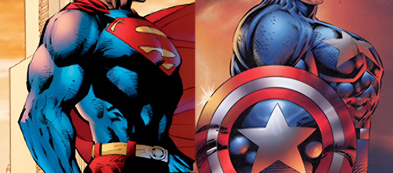
Now take a look at the top image. On the left is Jim Lee, who is generally undisputed as a good artist. On the right is a common example people use to demonstrate that Rob Liefeld is a bad artist. Do you see what I see? Yes, they are nearly identical. So how can one be good and the other be bad? Well let us look a little closer.

It’s the shield. Behind that shield, people assume, is a straight back, and the only explanation is that the chest is too puffy or something, due to Rob Liefeld not knowing anything about anatomy. But as you can see from the drawing, he knows plenty. Granted there is plenty of exaggeration in the chest area, the head measurements are spot on.
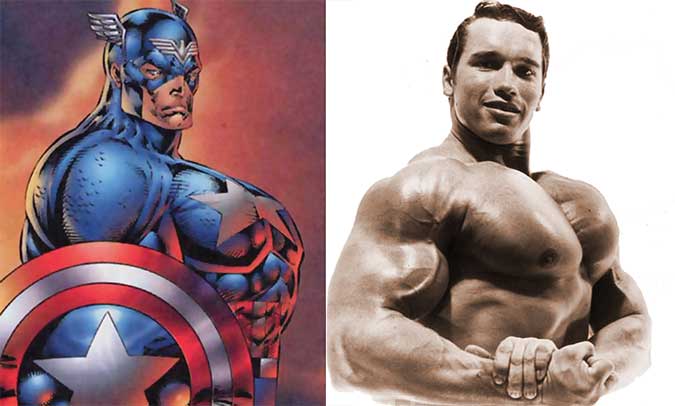
If I knew who figured this out first I would give credit, but someone in the vast arena known as the internet pointed out the similarities between Rob Liefeld’s Captain America drawing and a photo of Arnold Schwarzenegger. Could this have been used as a photo source or inspiration? It is true that Arnold is flexing in the photo, but at the very least it could explain where the exaggeration originated from.
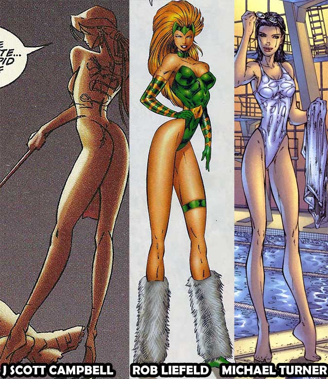
Often Liefeld is picked on for his depiction of women. What blows my mind is that no one seems to realize that tiny waists and long legs were the way things were done during the mid-nineties. Just take a look at some of the early Image Comics artists in titles like Fathom or Gen 13. The only difference I see is that Liefeld did not seem to use the invisible-high-heels trend.